Glow-Ki Skincare Brand Identity
Project Stages
- 01Kiwi study
- 02Logo sketches
- 03Selected mark
- 04Packaging
- 05Applications
Chapter 1
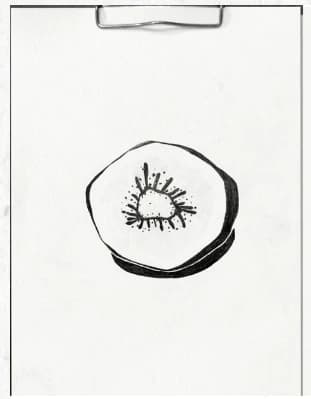
The selected direction began as a hand-drawn kiwi form, reducing the fruit to a central shape, radiating seeds, and an irregular outer texture.
Chapter 2
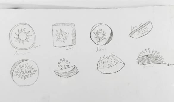
Circular slices, seeds, splashes, and simplified fruit forms were tested before the identity moved toward its final symbol.
Chapter 3
The project moves from broad fruit studies to the selected mark, then into a resolved packaging application.
Chapter 4
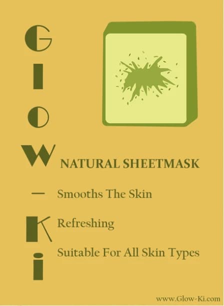
The final direction combines the kiwi mark with olive green, warm yellow, editorial serif typography, and a vertical Glow-Ki word treatment.
Chapter 5
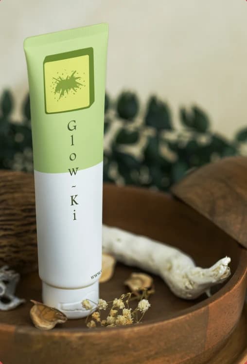
The identity is applied to a natural sheet-mask package and a skincare tube mockup.
Chapter 6
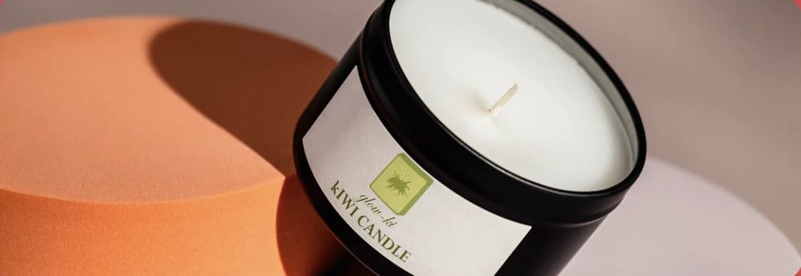
A kiwi-scented candle extends the visual identity into a wider lifestyle application.
Chapter 7
The final identity carries one organic mark and recognizable green palette across packaging and product applications.